Role: Graphic Designer
Tools: Adobe InDesign (print), Kindle Create (e-book)
Scope: Book layout, typography, image integration, e-book conversion with responsive formatting.
Tools: Adobe InDesign (print), Kindle Create (e-book)
Scope: Book layout, typography, image integration, e-book conversion with responsive formatting.
Overview
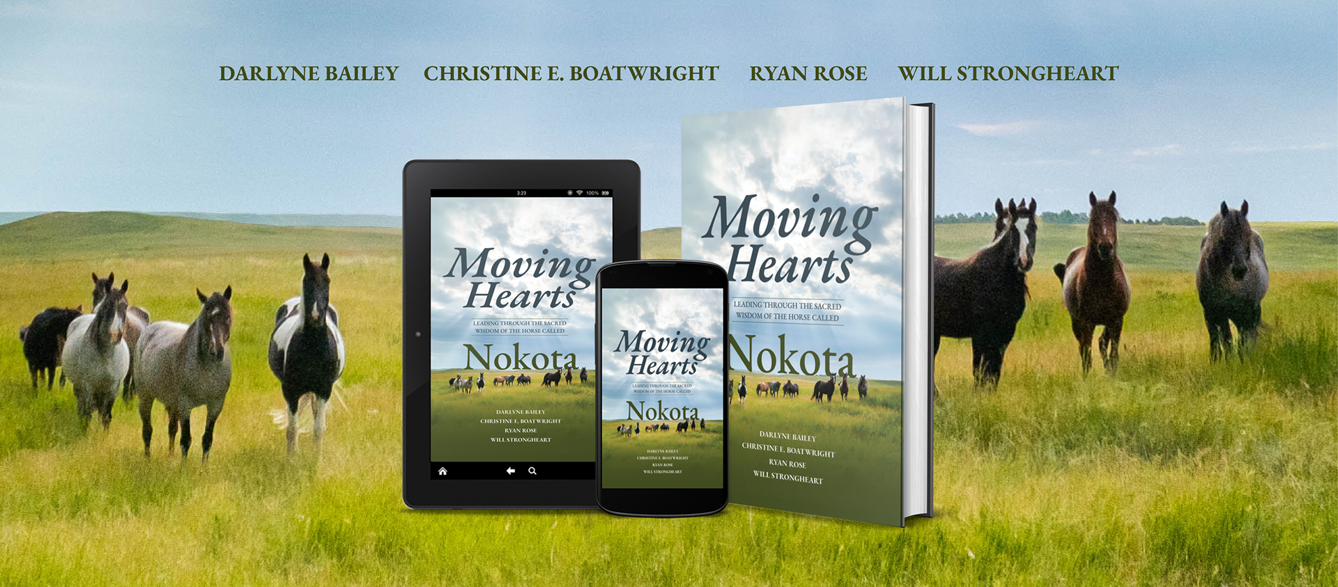
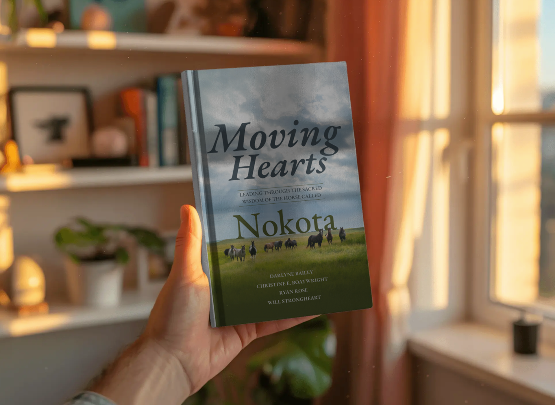
Moving Hearts: Leading Through the Sacred Wisdom of the Horse Called Nokota is an inspirational leadership book that explores personal growth, healing, and transformation through the unique relationship between humans and horses. The project required the development of both a professionally designed print edition and a responsive digital eBook optimized for Kindle devices.
As the book production designer, I created the interior print layout in Adobe InDesign, developing a clean, readable design that balanced narrative storytelling with visual elegance. The layout process included typography selection, chapter structure, image placement, page composition, and preparation of press-ready files for publication.
To expand accessibility and distribution, I also converted the manuscript into a Kindle eBook using Kindle Create. This involved adapting the content for responsive digital reading, optimizing navigation, formatting chapters and front matter, and ensuring compatibility across Kindle devices and applications while preserving the integrity of the print design.
The final deliverables provided readers with a seamless experience across both print and digital formats, supporting the book's broader reach and long-term publishing goals.

Content Preparation & Editorial Structure
– Before design begins, the manuscript is shaped for both readability and format flexibility.
– Final manuscript edited and structured (chapters, headings, front/back matter)
– Established hierarchy: chapter titles, subheads, pull quotes, reflections
– Identified moments for visual pacing (e.g., emotional beats, storytelling pauses)
– Created a style guide (typography, spacing, tone consistency)
Why it matters
This step ensures the book translates seamlessly across print and digital formats without rework.
Layout & Grid System
– Designed a flexible master page system (mirrored margins, running headers, folios)
– Established baseline grid for typographic consistency
– Defined trim size, margins, and gutter for readability and binding
Typography & Visual Language
– Selected serif typeface for body text (long-form readability)
– Paired with complementary display font for chapter openings
Style/Theme
– Chapter openers (full-bleed or spacious layouts)
– Pull quotes and reflective passages
– Section breaks to support pacing
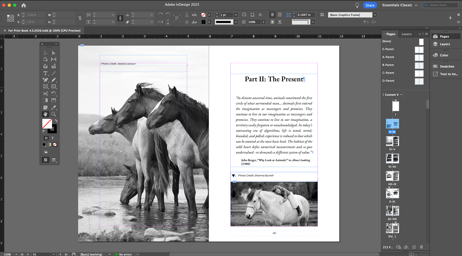
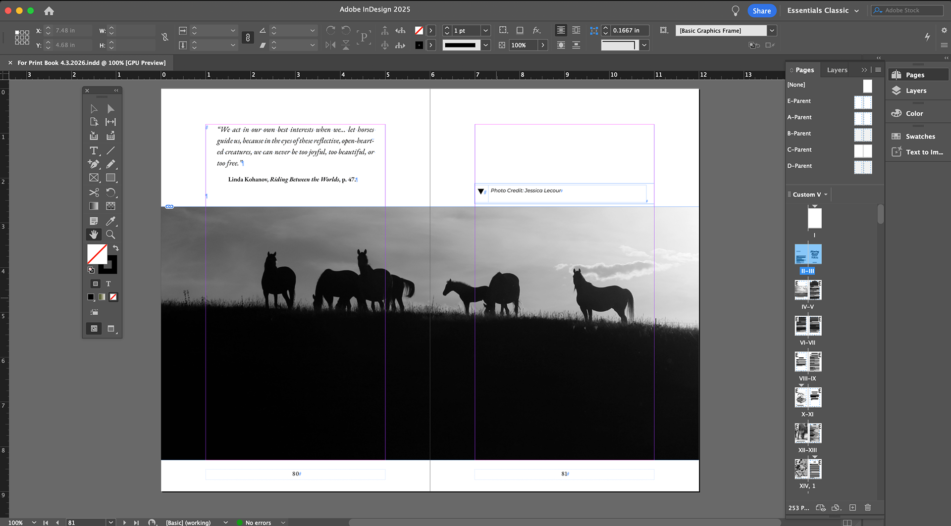
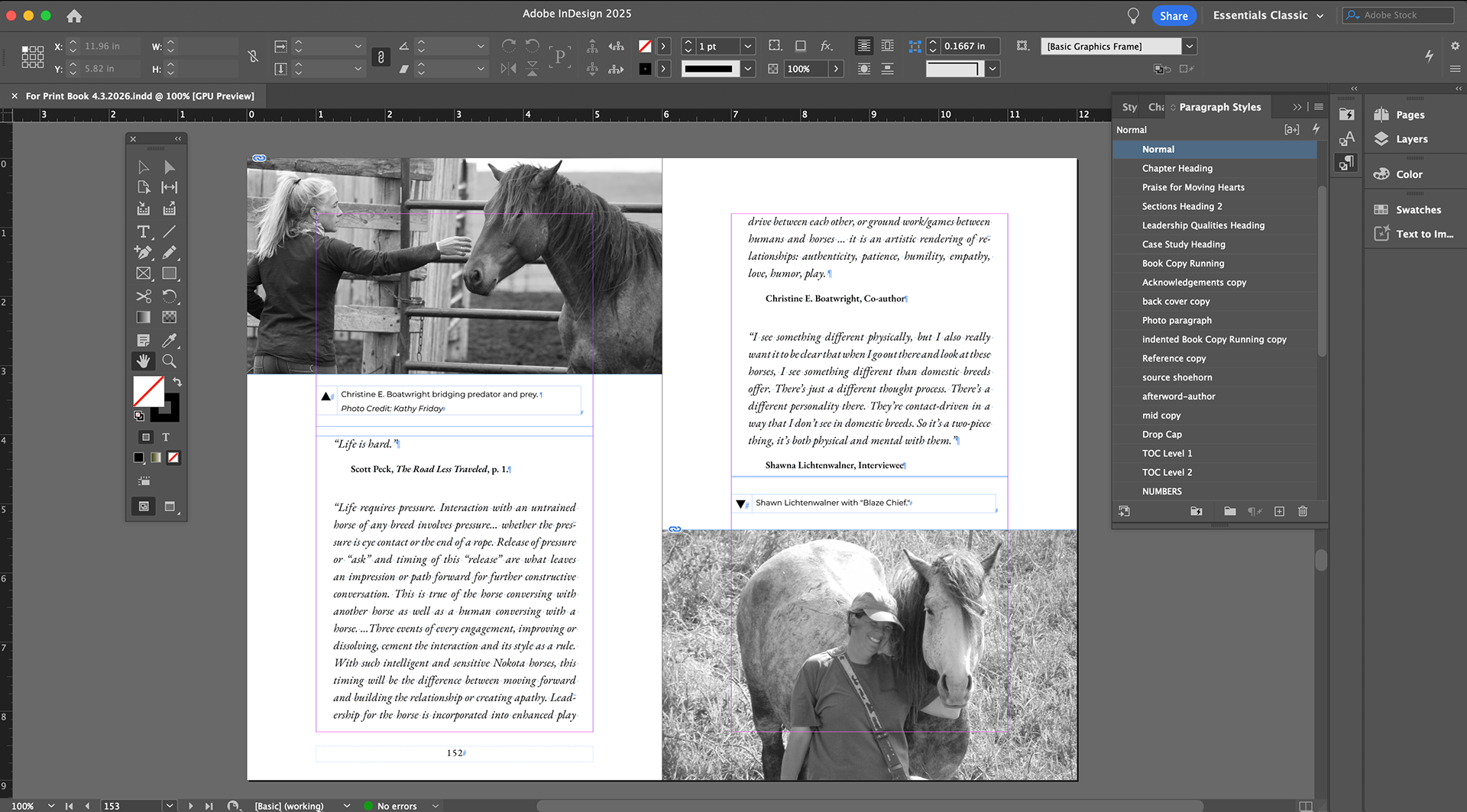
Image Integration
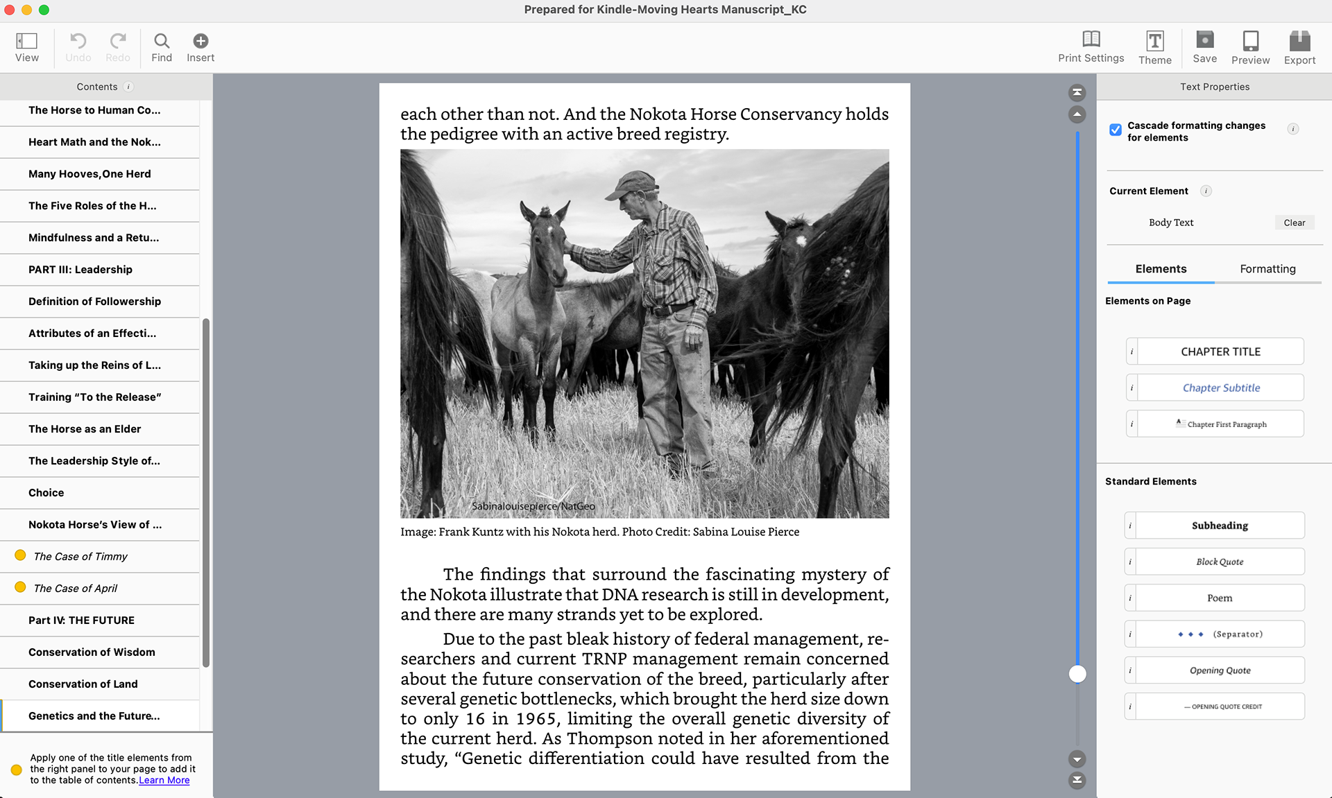
– Placed and color-corrected imagery of Nokota horses
– Balanced text-to-image ratio to avoid visual fatigue
– Ensured print-ready resolution (300 DPI, CMYK conversion)
Production Prep
– Preflight checks (fonts, links, overset text)
– Exported press-ready PDF (bleeds, crop marks)
– Adjusted for print vendor specifications (KDP or offset)
Outcome
A tactile, immersive reading experience that reflects the emotional tone of the content.
E-Book Conversion in Kindle Create
Import & Structural Mapping
– Imported manuscript (Word)
Applied Kindle Create styles:
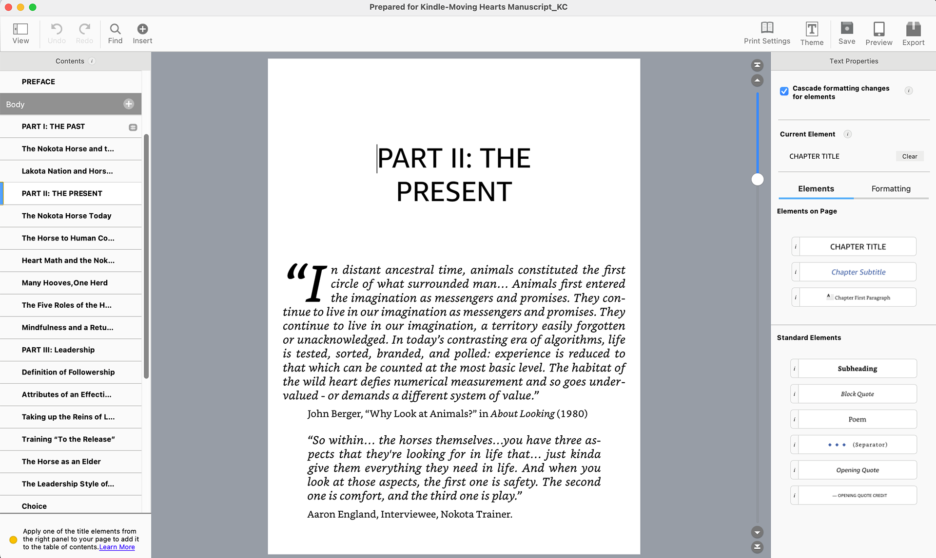
– Chapter titles
– Body text
– Scene breaks
– Generated interactive Table of Contents
Responsive Formatting Approach
– Unlike print, Kindle Create is not fixed layout—it’s reflowable and device-responsive.
Key considerations:
– Avoided manual spacing, tabs, or fixed positioning
– Used semantic styling instead of visual overrides
– Simplified typography (limited font control across devices)
– Ensured images scale proportionally across screen sizes
Responsiveness in Kindle Create
Designing in Kindle Create requires a shift in mindset from layout to system thinking:
What “Responsive” Means in E-Books
– Text reflows based on:
– Screen size (phone, tablet, e-reader)
– User settings (font size, typeface, spacing)
– Layout is not pixel-perfect—it’s reader-controlled
Design Adaptations
– Designed for flow, not fixed placement
Avoided:
– Multi-column layouts
– Complex text wraps
– Precise image anchoring
Prioritized:
– Clear hierarchy (via styles, not spacing)
– Shorter paragraphs for mobile readability
– Consistent section breaks
Testing Across Views
– Previewed across device types in Kindle Create: (a) Phone, (b) Tablet, and (c) Kindle e-reader
– Adjusted content where hierarchy or flow broke down
Accessibility & Readability Considerations
– Used clean, semantic structure for screen readers
– Ensured sufficient contrast for digital reading
– Avoided overly decorative typography in e-book version
– Maintained consistent heading structure for navigation
Final Deliverables
Print: High-resolution, press-ready PDF
E-book: .kpf file exported from Kindle Create for Amazon KDP
<!-- Google tag (gtag.js) --> <script async src="https://www.googletagmanager.com/gtag/js?id=G-LSLZJ6ZR5D"></script> <script> window.dataLayer = window.dataLayer || []; function gtag(){dataLayer.push(arguments);} gtag('js', new Date()); gtag('config', 'G-LSLZJ6ZR5D'); </script>